
Custom Server Link buttons using button-card
Home Assistant Template
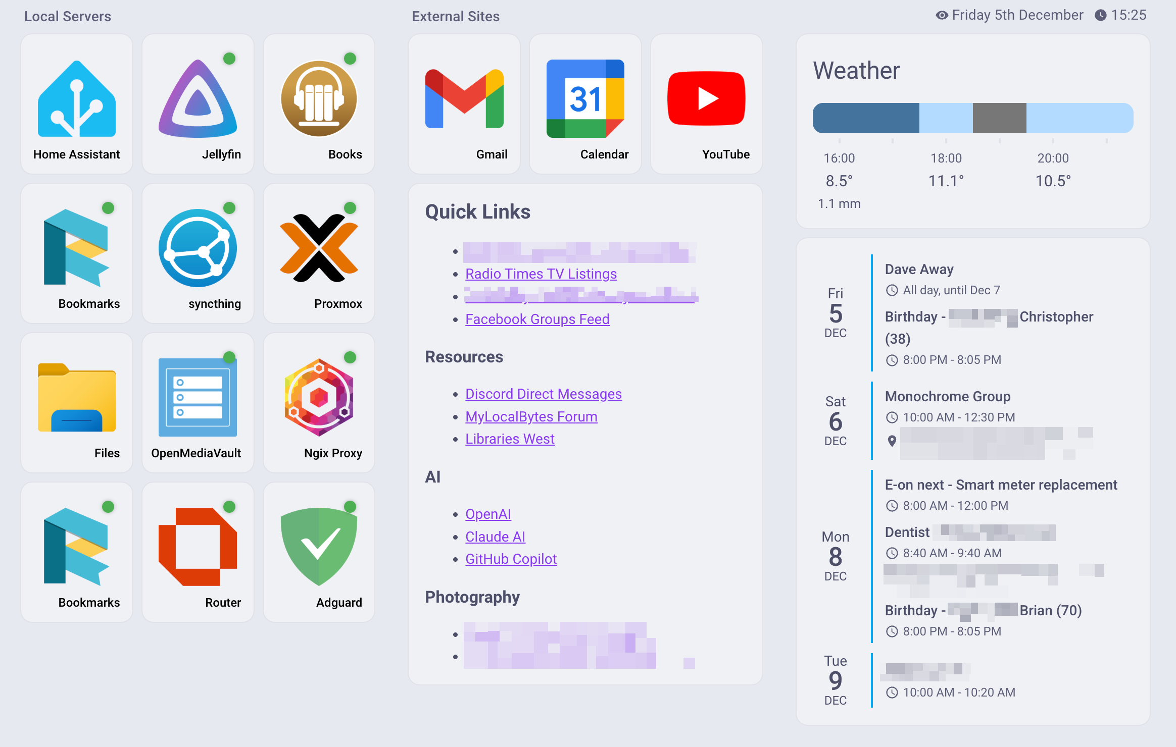
The image above is my new landing page inside home assistant for daily access.
The buttons on the left are built using one of two button card templates.
image_link_template and image_link_status_template the second is a child of the first and adds a dot to check if the entity field has a value of up which is what my uptime kuma integration picks up.
Both are easy to use once the template code is added to the top of the dashboard file in the Raw editor.
image_link_template
The values are
image: Url to the image to use
url: url to open when the button is pressed.
type: custom:button-card
template: image_link_template
name: Home Assistant
variables:
  image: https://cdn.jsdelivr.net/gh/selfhst/icons@main/png/home-assistant.png
  url: https://ha.taubman.uk
image_link_status_template
entity: The entity field for the Uptimekuma or ping sensor
type: custom:button-card
template: image_link_status_template
name: Jellyfin
variables:
  image: https://cdn.jsdelivr.net/gh/selfhst/icons@main/png/jellyfin.png
  url: https://jellyfin.taubman.uk
entity: sensor.jellyfin_status
The Two Templates
button_card_templates:
  image_link_template:
    tap_action:
      action: url
      url_path: '[[[ return variables.url; ]]]'
    show_icon: false
    show_name: true
    show_label: false
    styles:
      card:
        - height: 140px
        - max-width: 150px
        - padding: 10px
        - background: var(--ha-card-background, var(--card-background-color, white))
        - border-radius: var(--ha-card-border-radius, 12px)
        - box-shadow: var(--ha-card-box-shadow, none)
        - display: flex
        - flex-direction: column
        - justify-content: space-between
      grid:
        - grid-template-areas: '"image"'
        - grid-template-columns: 1fr
        - grid-template-rows: 1fr
        - position: relative
      img_cell:
        - justify-content: center
        - align-items: center
        - height: 100%
        - width: 100%
      custom_fields:
        image:
          - width: 86%
          - height: 86%
          - object-fit: contain
          - margin: 1% 7% 13% 7%
      name:
        - position: absolute
        - bottom: 0
        - right: 0
        - justify-self: end
        - text-align: right
        - font-size: 12px
        - font-weight: 500
        - padding: 2px 2px
        - color: black
    custom_fields:
      image: |
        [[[
          return `<img src="${variables.image}" style="width: 100%; height: 100%; object-fit: contain;">`;
        ]]]
  image_link_status_template:
    template: image_link_template
    show_state: false
    styles:
      custom_fields:
        status_dot:
          - position: absolute
          - top: 8px
          - right: 8px
          - width: 12px
          - height: 12px
          - border-radius: 50%
          - box-shadow: 0 0 4px rgba(0, 0, 0, 0.3)
    custom_fields:
      status_dot: |
        [[[
          const state = entity ? entity.state : 'unknown';
          let color = '#9E9E9E'; // default gray

          if (state === 'up') {
            color = '#4CAF50'; // green
          } else if (state === 'on') {
            color = '#4CAF50'; // green

          } else if (state === 'down') {
            color = '#F44336'; // red
          }

          return `<div style="width: 100%; height: 100%; background-color: ${color}; border-radius: 50%;"></div>`;
        ]]]